When browsing the web, you’ll find that many websites that you come across are based on WordPress. That’s no surprise considering around 75 million sites use the platform to run their businesses. From just a quick search you’ll see a whole plethora of websites, designed for all industries including hospitality websites, educational, food and drink, finance, and so many more.

WordPress is an extremely powerful CMS system that will allow you to achieve any desired look, one of the reasons why it’s one of the leading platforms. By using WordPress you will not only benefit from it being SEO optimized and well structured, but it also has a big community behind it and is very flexible. It is a user friendly platform and you can opt to create a website using one of the many themes available within the Envato Market. You can then either implement this yourself or hire a professional to do it for you.
As touched upon above, if you are wanting to design your site yourself, then there are several themes to choose from that will make the process of building your site that bit easier – One of these themes is called Avada.
Avada is one of the most popular themes in the marketplace with over 660,500 sales. It is designed to give you the creative freedom to make any website as a beginner or a professional. Absolutely no coding knowledge is needed, the only limitation is your mind and how creative you want to be. Below are ten sites that have used the Avada theme to give you a live example of something that can be achieved by using this theme:
Jack Whitehall

Jack Whitehall is one of the UK’s most well-known comedians and he has starred in many famous tv shows across the UK and the World. These include Sky One’s League of Their Own, his own Netflix series Travelling With My Father, and Bad Education. He has also performed many Stand Up Comedy events selling out the O2 Arena and performing at Edinburgh Fringe Festival.
His website is a prime example of a celebrity using Avada to promote themselves and the performances they have done. The site consists of a blog, portfolio area, E-Commerce store, and pages about him. It is very well designed on desktop and mobile with a quick load speed.
Visit Jack Whitehall’s Website
Ron Spohn
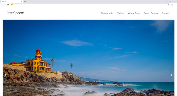
Ron Spohn uses Avada to create a beautiful website that showcases a variety of his photographs, videos, live tours, and agency section. The design is clean, simple to use, and easy to navigate. The imagery is extremely high quality, showcasing the importance of having good, high res images across your site. The website is easy to navigate and shows how Avada can be used to create a premium portfolio site to show off your work.
Russell Brand
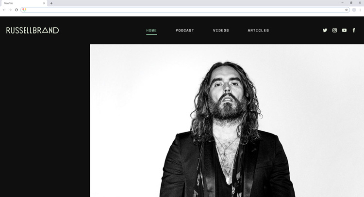
Another famous celebrity that uses the Avada theme for their website, Russell Brand is a famous presenter, actor, and comedian from England that most of us are sure to have heard of. Throughout his career, he has been cast in a variety of films and TV programs as well as stand up comedy performances.
His website is another example of a well-executed portfolio site. By using the Avada theme he has been able to showcase his podcasts, video, and writing. The site uses a full-width layout and presents itself well on both desktop and mobile devices. His website uses a darker colour palette which is very effective in getting people’s attention.
I Do Wedding Rings
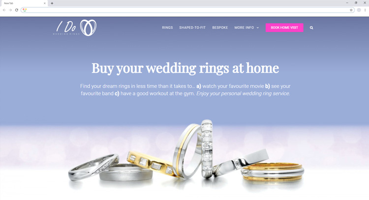
I Do Wedding Rings is a responsive E-commerce website that sells wedding rings to the public. Beautiful imagery is used throughout the site and the layout is very effective and easy to understand. With just a few clicks you can purchase a ring, or arrange an appointment with the owners. The full image background on the homepage is an effective way to grab the audience’s attention, while the purple call to action button is noticeable instantly.
Visit I Do Wedding Rings Website
Mathletics

A prime example of a company making full use of Avada’s available features and functions is Mathletics. On loading the site your interest in instantly piqued, with their effective yellow colour scheme. The initial menu on the site presents a video and whilst you click around the site you will soon see how intuitive and user friendly it is. The loading speed is quick and the animation they use as you scroll down the page shows how engaging they want the site to be.
LittleBig Bikes
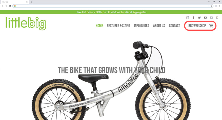
The LittleBig Bikes makes use of Avada’s E-commerce functionality as well as other features. When clicking the browse shop button, you are able to see a list of all their products and purchase them directly from their website. The footer uses a five-section split, with imagery being used to present their awards as well as a newsletter sign up and navigational links. The rest of the site is easy to get around and you’ll come across other features that you can use like their FAQ section or contact us page.
Pump Fitness
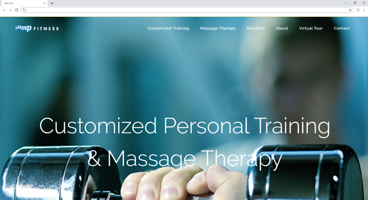
Pump Fitness shows a great example of how they are making use of the parallax scrolling function. What this means is that they don’t have multiple pages to click on. When you click a link within their menu, the site scrolls down the page to that section. This is accompanied by large imagery that spans across the full width of the page and the use of coloured icons to indicate what section you are on. When on the mobile version, the images centre nicely and the parallax scrolling is very effective.
Vermeij Design
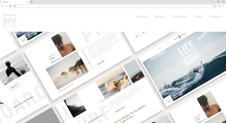
Gabrielle Vermeij is an art director and UX/UI designer who uses her website as a portfolio site to show off her work. The design is very clean and effective. It relies on well-created imagery to capture potential client’s interests and for them to get in touch with her. Most of the pages on the site make use of the portfolio function allowing her to display her work in a captivating way. The contact me page makes use of the form function so that users can send messages to get in touch with you. Her site is straight to the point and shows how Avada can be used to create a portfolio website, no matter your industry.
Microsoft
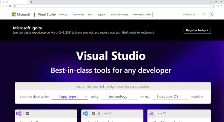
For such a large company and a major player in the technology world, you may be surprised to hear that the visual studio section of their website is made using Avada. This is a prime example of how Avada is used by a big company to promote its services. Many key components to Avada are used in the example. The website itself is easy to understand and straight to the point. Full-width sections are used along with good quality imagery and easy to follow transitions.
Manny and Me
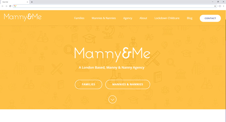
Manny and Me is a London based agency that is there to help look after your children. They are highly regarded, receiving plenty of five-star reviews for their service. Their website is built using the Avada theme and upon loading, you will see a visually appealing colour palette that instantly grabs your attention. By using icons in front of the background they create a pattern that makes the page more interesting than just a bland colour. It’s responsive on all devices, very quick to load and makes use of the different widths of the page. A blog is used within this site as well as a contact form and plenty of imagery. The use of colour is executed extremely well within this site, giving you a good example of how colour can create a certain look on a website.
As you can see from the examples above, Avada is an extremely powerful theme that allows you to customize pretty much anything on your website. Whether you are looking to create an eCommerce site, blog or a brochure website to sell your services, the Avada theme should have you covered. Plus, the way it’s built makes it easy for a future developer to take over your site and enhance it should you need to. If you need some support with the Avada theme you can use their support section and follow their step by step instructions, if that’s not enough you can always contact their team directly with any questions you may have.
Have you created your site using the Avada theme? What does your website look like? Do you know of any other examples of people using the Avada theme? Let us know in the comment box below, we would love to hear from you.
Try out our official WordPress plugin at https://transferito.com
